Design: Font
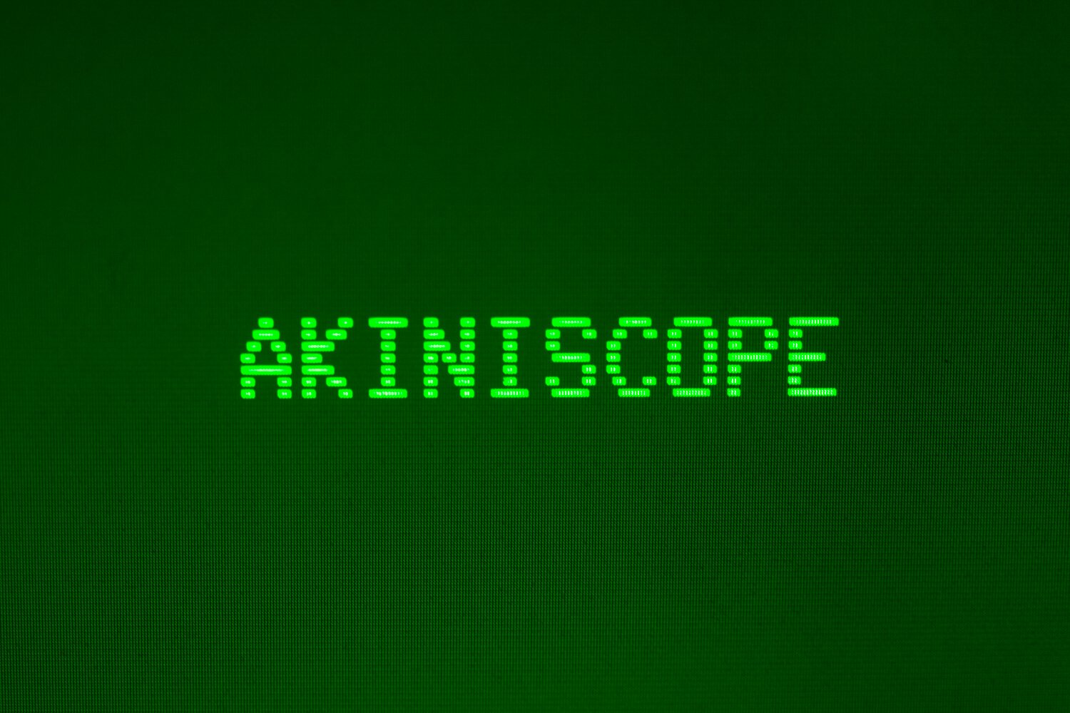
Having written most of my early programs using a DEC VT100 terminal, I knew I wanted some of the feel of that type of equipment involved: The green glow of a CRT display, and the lined characters of the font embedded within the terminal. So I hunted for a font that emulated those terminals, and learned something of those terminals I had never known at the time.
The first one I found was the VT323 Font. It had the blockyness of the font right, but it wasn’t made up of horizontal lines, as I remembered.
I then found GlassTTY: TrueType VT220 font. The author’s description of designing the font is here. This fitted better with my memory of how the font looked, and that’s what I’ve used.
I would have liked some more greek characters, to show some pseudo-mathematical terms, but I’m happy there are plenty of symbols in there, to use.
The final element was setting the colour: A bright green for the font, and a dark green for the background. This was done with a little comparison with some old equipment, and looks about right. I’ve tried to emulate the background fade in, as Akiniscope starts, which a CRT display would do, but controlling all the parts of a modern computers start up process may prevent this. I will try, though.